The winners of our creative gap challenge have been chosen – and they are as different as architecture can be.
Easily Develop a Construction Model
A gap – that’s all it takes to fire the imagination of architects. In the annual ALLPLAN Challenge “Design the Gap”, ALLPLAN users are encouraged to do just that. The challenge is to close a theoretical but clearly defined construction gap. This year, creative minds had around two months to submit their designs for a 25 by 5.7 meter open space between two buildings. Among the total of about 30 submissions, no two were alike. From these, the ALLPLAN jury selected five winners according to the criteria of constructability, appearance, and use of the given space. The first two places won VR glasses and a 3D printer respectively. Places three to five each received a coffee-table book about Zaha Hadid.
1st place: Lars Stollbert, residential building with commercial first floor use
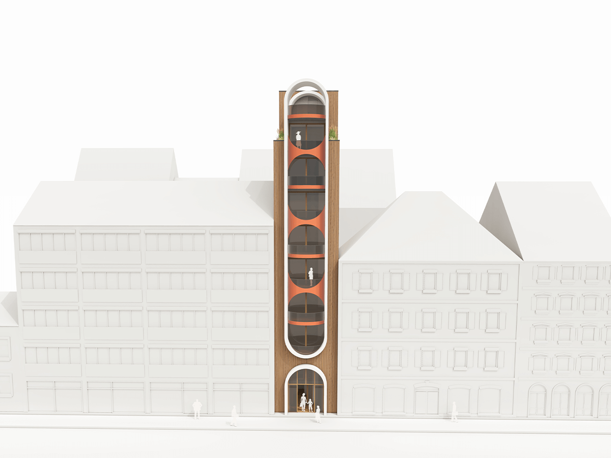
The first place was won by Lars Stollbert with a residential building including commercial first floor use. His declared goal was “a building that offers living space in the very narrow gap with the highest possible level of comfort – given the circumstances.” This should also not be perceived simply as a gap filler, but as a building that stands on its own. “The characteristic arched facade therefore allows the building to stand out clearly and gives the gap or the structure the necessary emphasis and presence,” explains the architect from Schramberg. For his design, he tried out different variants both in the floor plan and in the shape and façade, whereby the flexibility in ALLPLAN was very beneficial to him.
2nd place: Rama Saloukha, cantilevered residence

Second place goes to Rama Saloukha from Grevenbroich for her design of a beautifully shaped residential building with a store on the first floor. A particularly unique feature is the playful and at the same time harmonious façade, which cantilevers out a little on every second floor, creating an exit for the floor above in each case. Each level has its own floor plan. Small details such as the indentation in the façade on the fifth floor or the balanced greenery round off the overall work of art. The access to the entrance of the residential floors is located on the rear side of the building. It is also worth noting that Rama Saloukha is an architectural draftswoman in training. We think such a fine sense of space and form would definitely be an asset to the architects’ guild!
3rd place: Joseph John, art gallery/exhibition space
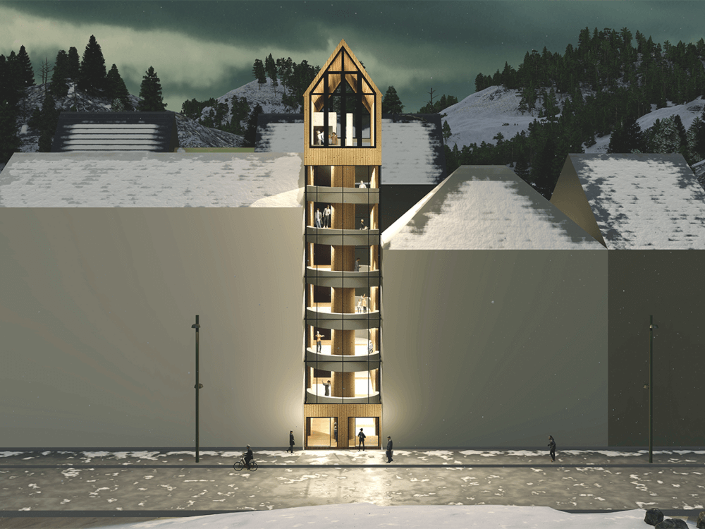
Third-place winner Joseph John from the United Arab Emirates had a completely different idea for the gap. The architect created a community-oriented art gallery with an observation deck on the top floor and a wine cellar or coffee shop in the basement. The building is open to both sides of the street, connected by a pathway on the first floor. The geometry is based on the surrounding buildings, with a particular focus on the choice of materials and a modern construction method. The interior is virtually a single ramp that winds from the base to the top floor. Other vantage points are located on the open sides at all levels. A central elevator core serves as the backbone of the structure.
4th place: Daulet Abdrakhanov, multifunctional building
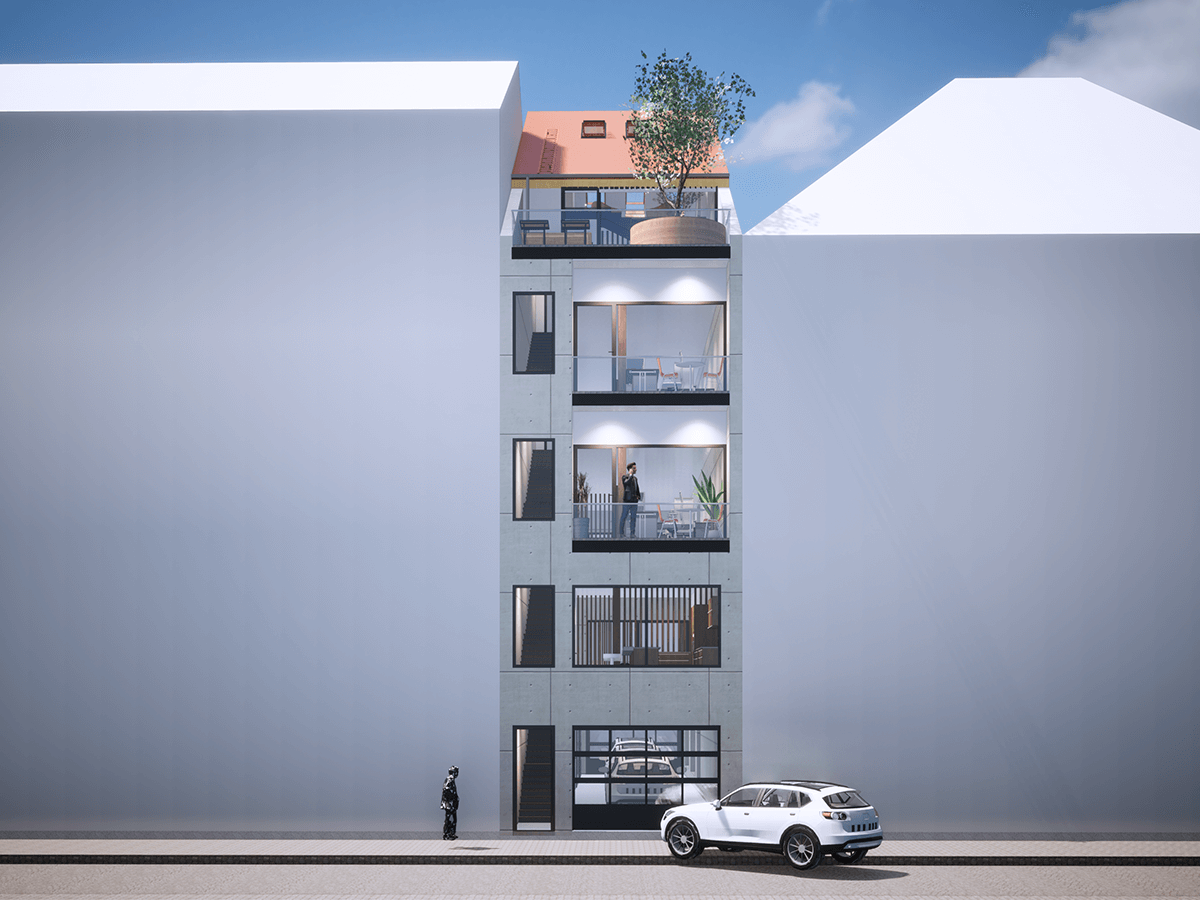
The most multifaceted design comes from Daulet Abdrakhanov from Kazakhstan, who thus takes fourth place. In his multi-purpose building, not only does almost every floor have a different function, but on top of that it can optionally be used for several purposes at once. For example, the first floor can be used as a car wash during the day, while in the evening it can be turned into a “garage lounge” if required, or simply used as a parking space all of the time. A café or bar can be found on the second floor, while floors three and four can be used as coworking space or open-plan offices for individual companies. Coworking as well as relaxation and gaming are available at the very top either for everyone or for the “bosses.”
5th place: Adam Gorczyca, Cristal
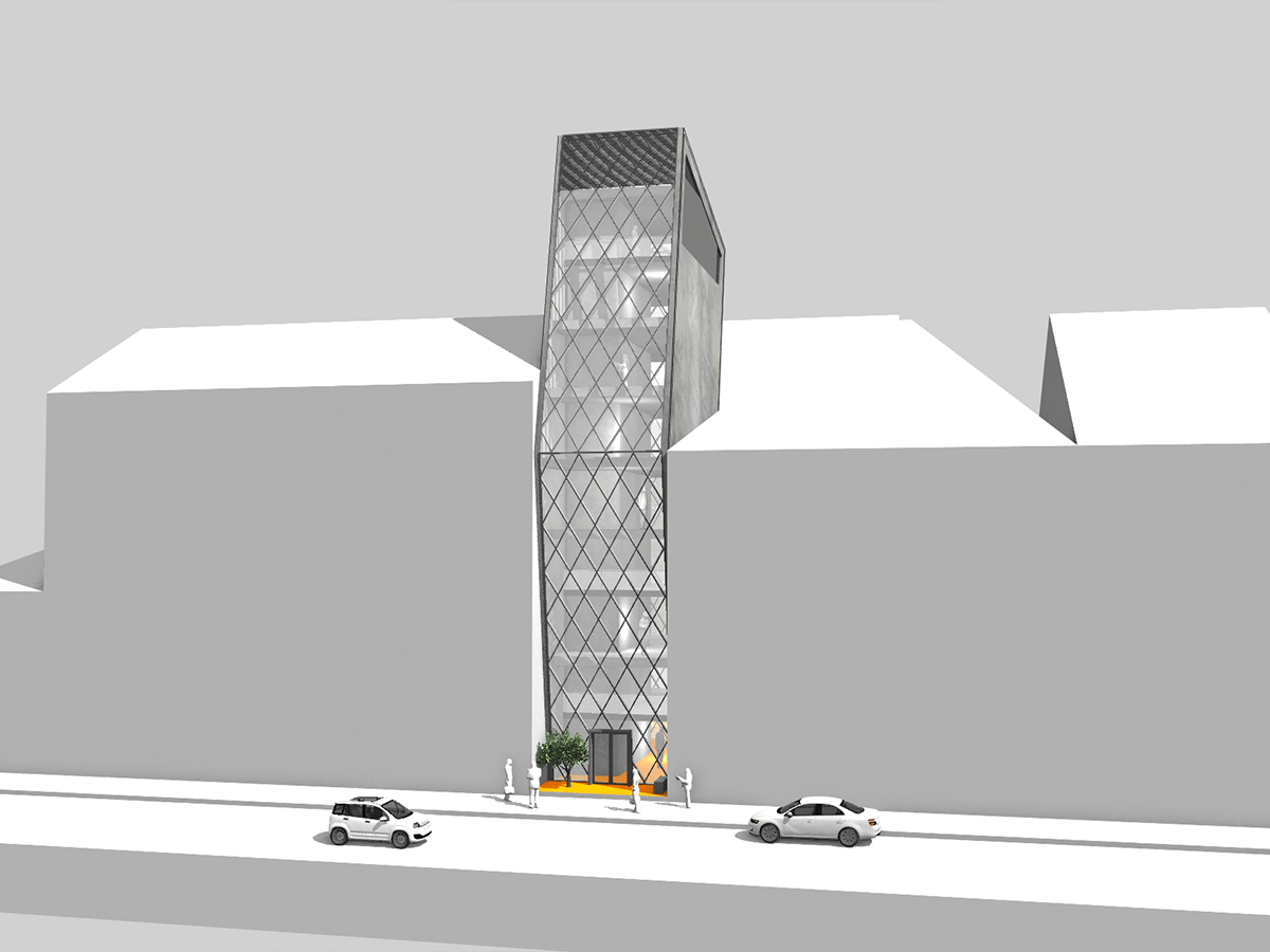
The last Zaha Hadid book goes to Polish architect Adam Gorczyca for his design, “Cristal”. Particularly striking is the diamond-shaped, subdivided glass façade, which initially (on the front side) slopes forward by about 30 degrees and then symmetrically in the other direction from halfway up, giving the whole a certain crystal-like effect. Among other things, this creates a prominent entrance, as the lower edge of the building recedes a bit due to the inclination. Complementing the glass, two continuous load-bearing concrete walls frame the diamond lattice. In terms of use, the mixed-use building includes four apartments on the upper four floors, offices on the lower four levels, and an underground semi-automated transportation system with eleven parking spaces.
Congratulations to the winners and many thanks to all participants!
Here you can view all submitted projects.